Disclaimer: My main area of expertise is SQL Server Business Intelligence and Power BI. I am a novice at Python. There are probably a million better ways to write the Python code, but I am impressed by the language and what I have been able to achieve with it.
I started using Python a bit more than 6 months ago because of the projects I am working on where data services are predominantly made available through rest APIs. The libraries available in Python made life easy and I knew it was inevitable for me to go down this road when Machine Learning Services (MLS) was released in SQL Server 2017.
To shorten a long story, I started using Python as a data staging solution using the Anaconda distribution (for machine learning capability and alignment to MLS). My focus was retrieving data from APIs into Pandas dataframes and then writing the results to SQL Server tables. Python proved to be surprising easy to learn (although I had some .NET background), although I knew my focus was incredibly narrow.
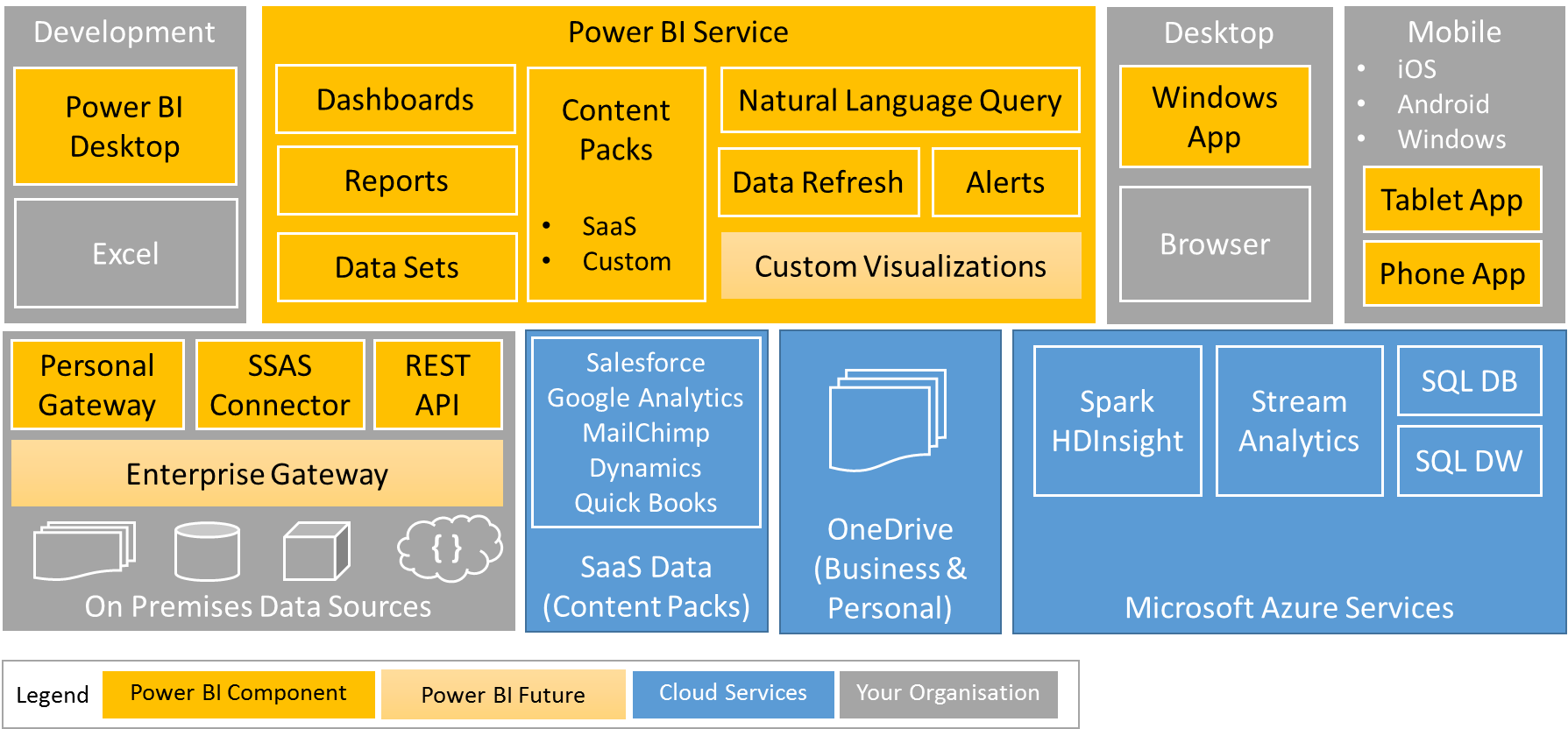
When Microsoft announced a preview of Python integration (for both Power Query and data visualization) I was so excited that I got up early on a bank holiday to try it out for myself. There was literally no examples to follow other than the data visualization bits from the blog post announcing the August release of Power BI Desktop.
I made some assumptions that the Pandas dataframes would be recognized by Power BI and got the Power Query bits working quickly. I struggled a little bit with a basic Python data visualization because it was the first time I ever tried to use Python for visualization. The end result was 3 simple steps to enable Python in Power BI and 3 more steps to get started with Python in Power BI.
Step A: Install the August 2018 release of Power BI Desktop
Step B: Enable Python support from the Preview features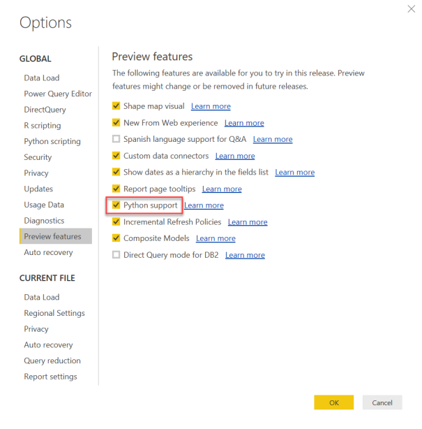
Step C: Restart Power BI Desktop and set your Python home directory
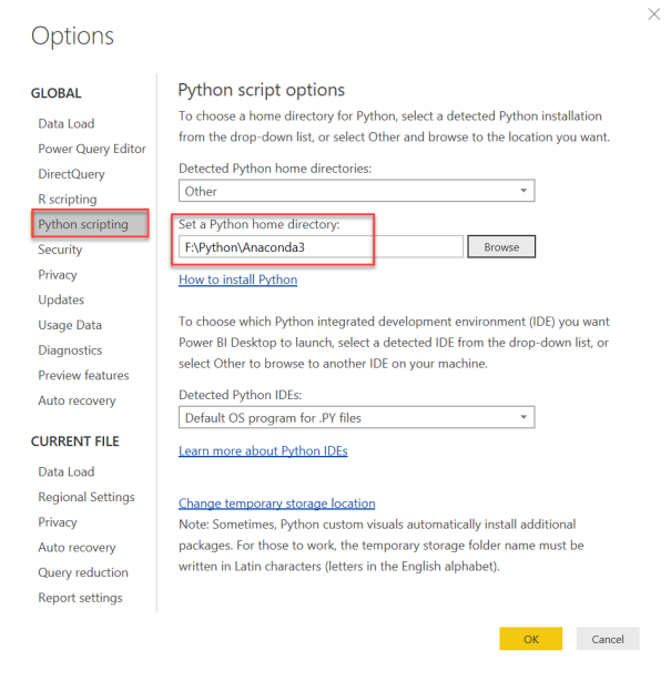
You may leave the default directory if you don’t have Python installed. Otherwise choose the path of the Python distribution you want Power BI to use when running your report.
Now 3 steps to get started with Python in Power BI
Step 1: Test your Python script in a Python editor
My sample data is a daily historical exchange rate for South African Rand (ZAR) against the US Dollar (USD). Its a simple CSV file containing the date and the ZAR amount for $1.
With the Anaconda distribution of Python, the Pandas data manipulation and analytics library is already installed. If you are using a different Python distribution, you may need to install Pandas.
The code has been kept fairly simple to get the basics right:
import pandas
df_USD = pandas.read_csv('D:\\data\\csv\\ZARUSD201x.csv')
df_USD.plot(kind='line', x=['ValueDate'], y=['TheValue'])
‘The first line of code adds a reference to the pandas library. The second line of code uses Pandas to open a CSV file and load it into a data structure called a dataframe. The third line of code plots a line chart using the date as the x-axis and the value as the y-axis.
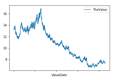
The result may look good in the image above, but it appears much smaller in the editor. The CSV file also adds one small issue viz. the data is sorted descending. We need two small changes to the code to improve the result.
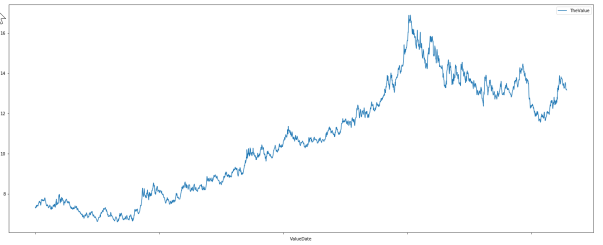
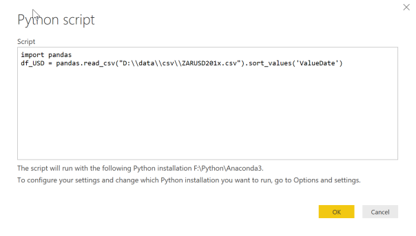
import pandas
df_USD = pandas.read_csv('D:\\data\\csv\\ZARUSD201x.csv').sort_values('ValueDate')
df_USD.plot(kind='line', x=['ValueDate'], y=['TheValue'], figsize=(25,10))
Line 2 makes use of the Pandas dataframe sort_values function to re-order the data. Line 3 adds the figsize parameter to control the display size of the chart. The result is much better.
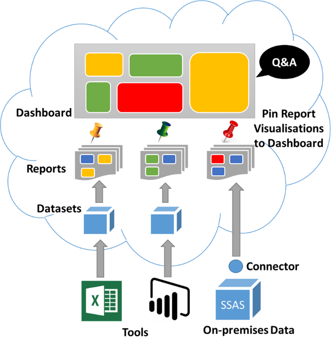
Step 2: Get data into the Power BI data model using Python script
Now that we have a working Python script we can add it to Power BI. We do this in two parts. In this step we add the data to the data model via Power Query and in step 3 we will add the code for the visualization.
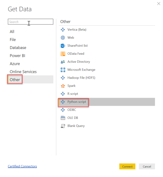
Copy the first two lines of code into the Python script dialogue.
The Navigator will show all available dataframes. In this example it will only be df_USD.
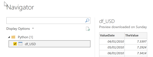
A preview of the data will be displayed when selecting the dataframe. The data types were correctly detected in this example so there is no need to edit in Power Query. Select Load to add the data to the data model.
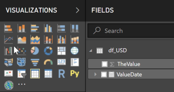
Step 3: Plot the data in Power BI using the “Py” visual
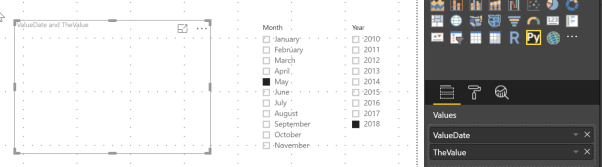
Add a “Py” visual to the canvas. You will need to enable script visuals. Add the value and date fields to the visual. Change the date field to show the actual ValueDate (not the hierarchy). To make the Py visual respond to slicers, add year and month slicers from the ValueDate hierarchy.
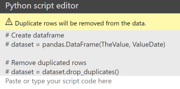
The “Py” visual will be blank initially and a Python script window appears below that. For the Python visual the data is required as a Pandas dataframe. The Power BI data model fields that are selected are converted to a dataframe (dataset) and the dataset is de-duplicated. This part of the script is generated by Power BI and appears in grey. The code to plot the chart goes below this.
Now copy the last line of code from the Python editor and modify it to use the Power BI dataframe.
dataset.plot(kind='line', x=['ValueDate'], y=['TheValue'], figsize=(25,10))
Unfortunately this does not render anything. If we look at the details of the error message we see that nothing is rendered (even though the Spyder editor was able to render the plot)
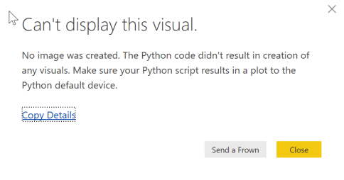
To fix this we have to use the matplotlib Python library to render the plot.
from matplotlib import pyplot
dataset.plot(kind='line', x=['ValueDate'], y=['TheValue'], figsize=(25,10))
pyplot.show()
Now the visual appears, but there is still one problem.
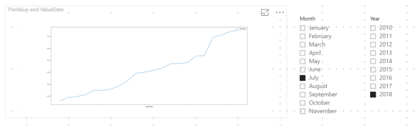
Its not impossible, but highly unlikely that the exchange rate is just climbing on a daily basis for July 2018. The problem here is that a Pandas dataframe has an index and automatically sorts the data on this index. To change the sort order we change the sorting of the dataframe in a similar way to the way we sorted the dataframe in step 1.
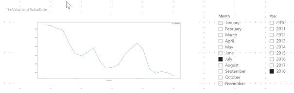
dataset.sort_values('ValueDate').plot(kind='line', x=['ValueDate'], y=['TheValue'], figsize=(25,10))
Now we get the correct result.
I hope this post helps you get started with Python in Power BI. While I’m a novice at Python, I thought it would be worth sharing with others who are also starting out.